
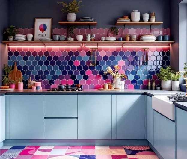
Why is choosing tile color for the kitchen so important?
The kitchen is not just a cooking space; it’s where we start our day with a cup of tea, where our guests gather together, and where so many memories are created. So choosing the right color for its tiles is definitely not a simple decision.
When you walk into a kitchen, the first thing that catches your eye is the color combination. The color of the tiles can make the space feel warm and energetic—or dull and lifeless. This article is here to help you not only find the right color combination for your kitchen, but also, if you decide to roll up your sleeves and do the tiling yourself, understand exactly what you need to do.
The Effect of Colors on Kitchen Spaces: Color Psychology in Interior Design
Color is not just a visual feature. Every color carries a particular mood and influences our emotions. For example, a color like blue creates a sense of calm, while red increases energy levels.
Let’s take a look at some commonly used colors:
White: The unrivaled choice for creating a sense of cleanliness and simplicity. With white, you never go out of style. If your kitchen is small, this color can make the space appear larger.
Light blue or turquoise: On hot summer days, these colors feel wonderfully refreshing. Ideal for those who are looking for a calm and well-organized space.
Yellow and orange: These colors are full of vitality. If you enjoy energetic breakfasts and a warm, friendly atmosphere, give them a try.
Gray: One of the most stylish and modern colors. When combined with wood or metal tones, it can make your kitchen truly stand out.
The real secret? Knowing which color aligns best with your lifestyle and personality.
Step 1: What tools do you need for tiling at home?
If you’re planning to get started yourself, you first need to know what you’ll be dealing with. There’s no need for complicated equipment, but there are a few essential tools you must have:
Tile cutter (manual or electric) – For cutting tiles cleanly and without hassle.
Tile adhesive (powder or paste) – Depending on the installation area; wall or floor.
Level – So your tiles don’t end up uneven!
Notched trowel – For spreading the adhesive evenly.
Tile spacers (clips or cross spacers) – To keep the gaps between tiles consistent.
Grout and sponge – For filling the joints and final cleaning.
A golden tip: Before starting the actual work, set aside a day to practice with the tools so you can get comfortable with them.
Choosing the right type of tile for the kitchen
Tiles are not just about color; their material, texture, and durability also matter. Here, we’ll take a look at a few common types of tiles:
Ceramic: Affordable, simple, and suitable for walls. If your budget is limited, ceramic is a solid choice.
Porcelain: More durable with lower water absorption. An excellent option for kitchen floors that require frequent washing.
Stone or wood-look tiles: Ideal for those who love the feel of nature but don’t want the maintenance challenges of real wood or natural stone.
So what’s the takeaway? First, decide where you plan to install the tiles (floor, wall, or backsplash), and then choose the appropriate tile material.
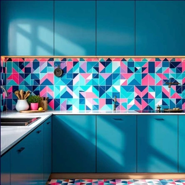
Popular color combinations for modern kitchens
If you want a modern and up-to-date kitchen, you need to understand that color combinations play a key role. The right choice will make your kitchen unique and eye-catching—not just an ordinary, lifeless space.
Popular ideas:
White and gray: A classic combination that always works. White makes the space look larger, while gray adds a stylish, industrial touch.
Navy blue with gold or brass: If you’re looking for a luxurious yet distinctive feel, try this combination—especially if you choose gold-colored handles and faucets.
Olive green and wood brown: This pairing creates a warm and natural atmosphere. Perfect for those who want their kitchen to feel cozy and inviting.
Matte black and glossy white: If you’re bold and love distinctive designs, this combination is very modern. Just make sure you have enough lighting.
Important note: Whatever combination you choose, try to keep one of the colors neutral to maintain visual balance.
Warm or Cool Color Combinations? A Guide to Choosing Based on Decoration Style
Sometimes, choosing a good color alone isn’t enough; you also need to understand the effect that color has on the space. This is where the classification of colors into warm and cool tones becomes useful.
Warm colors:
These include shades such as red, orange, yellow, and peach.
They make a space feel more intimate and energetic.
They work especially well in traditional or rustic kitchens.
Cool colors:
These include shades such as blue, green, and purple.
They create a sense of calm, cleanliness, and modernity.
They are ideal for minimalist and modern designs, as well as smaller spaces.
How should you choose?
Think about the feeling you want from your space. If you want your kitchen to feel lively and welcoming, go for warm colors. If you prefer a space that feels elegant, calm, and organized, cool colors are an excellent choice.
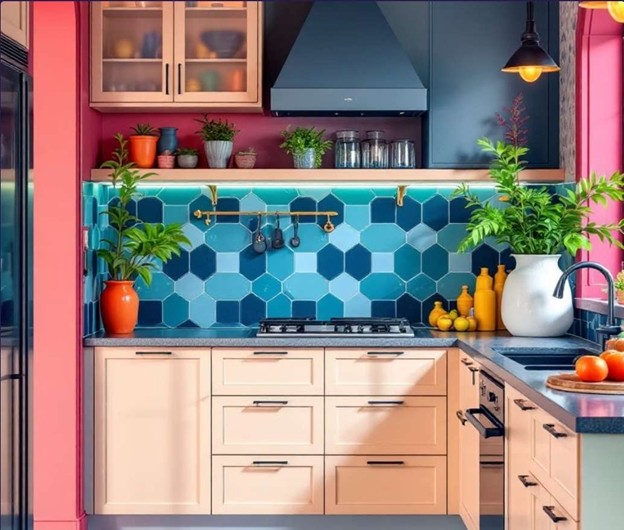
The best tile colors for small, large, or dark kitchens
Not all kitchens are the same. Some are small, and some lack natural light. Choosing the right color can completely transform the space.
For small kitchens:
Use light colors such as white, cream, or very light gray.
Glossy or glass tiles help the space appear larger and more open.
It’s better to choose tiles without busy patterns.
For large kitchens:
You have more flexibility. You can opt for darker colors such as navy or even black.
Combining warm tones like chocolate brown and burgundy can also create a luxurious and inviting atmosphere.
For low-light or windowless kitchens:
Definitely go for light and glossy colors. These shades reflect artificial light more effectively.
Installing LED lighting under the cabinets can also make a significant difference.
How to match the color of the cabinets, walls, and floors with the tiles?
Now we reach one of the main questions: “Alright, I’ve chosen the tile color—what should I do with the rest?”
My suggestion is to use the 60-30-10 rule:
60% of the space is covered by the dominant color—usually the walls or the floor.
30% is the complementary color—often the cabinets or the kitchen island.
10% is the accent color, which can be used in accessories or in the backsplash tiles.
For example:
White walls, gray cabinets, and lemon-yellow tiles.
Or light gray walls, olive green cabinets, and glossy white tiles.
A golden tip: It’s always better to see color samples side by side. You can even take a large piece of cardboard and attach each color to a different corner to see how they look under your home’s lighting.
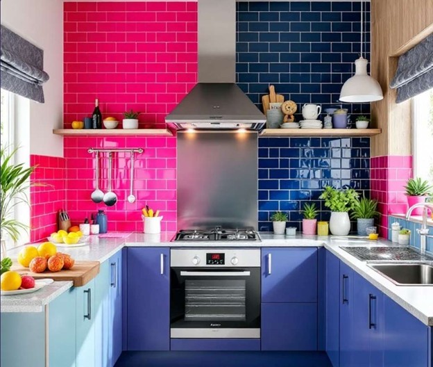
Real examples of color and style combinations for inspiration
If you’re still unsure about which colors to pair together, these real and tried-and-true examples can provide plenty of inspiration:
1: Scandinavian style (simple, bright, and warm)
Wall tiles: Matte white
Cabinets: Light wood
Flooring: Light gray
Features: Lots of natural light, space feels larger, minimalistic and calming atmosphere
2: Industrial and modern style
Wall tiles: Dark gray or concrete-look
Cabinets: Matte black
Details: Brass or gold accents for faucets and handles
Features: Bold and distinctive, perfect for large spaces
3: Rustic and traditional Iranian style
Backsplash tiles: Traditional patterned tiles (turquoise blue, white, orange)
Cabinets: Natural wood or white
Floor: Stone-look ceramic
Features: Nostalgic, warm, and inviting
Drawing inspiration from real-life models makes it easier to make decisions and ensures the final result is even more appealing.
Common mistakes in choosing tile color and how to avoid them
Many times, you might carefully choose everything, but once the installation is finished, the result isn’t what you expected. Usually, this happens due to one of these mistakes:
Ignoring kitchen lighting:
Low natural light or warm artificial light can make colors appear differently. Always test colors in your actual space.
Overloading with patterns and colors:
Patterned tiles, colored cabinets, textured walls… all together? Not ideal! It’s better to let only one or two elements in the space be the “stars.”
Neglecting harmony with the rest of the home:
A kitchen with glossy modern tiles in a house where other spaces are traditional can create a sense of mismatch.
Using too many dark colors in small spaces:
Dark colors make a space feel smaller, especially if there isn’t enough light.
To avoid these mistakes, always simulate first. Draw a simple layout on paper, or even create a basic model using interior design apps.
Technique for using a ready-made color palette + helpful tools
When you don’t know where to start, ready-made color palettes are the perfect starting point. Popular paint brands, interior design websites, and even Instagram are full of pre-designed color combinations.
A few useful tools:
If you see a particular tile you love, you can upload its photo to tools like Adobe Color to extract its colors.
Tile stores often have inspirational booklets showing several color schemes together.
My suggestion: Pick one of these palettes, draw inspiration from it, and then personalize it with a few tweaks to make it your own.
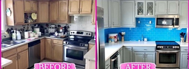
A few golden tips before starting the project
Before you stick the first tile, pause for a moment and read these tips. This is the turning point for the success of your project!
Start from a secondary wall: The first tiles are often the least precise, so it’s better to begin where they’re not in direct view.
Don’t forget spacing between tiles: Some people stick tiles directly together. That’s a mistake! Use spacers to keep the joints even.
Apply grout carefully and cleanly: The grout color also affects the final look. For example, white grout on dark tiles can make the space feel busy.
Let tiles dry for 24–48 hours after installation before applying grout.
And finally? Admire your work! With smart color choices and a bit of effort, you’ve created a cozy space without needing a professional installer.
Summary
Choosing tile colors for your kitchen isn’t a simple decision; it’s a choice that affects your home’s atmosphere, your guests’ mood, and even your own feelings. By following the principles of color combinations, understanding your space, and adding a touch of creativity, you can transform your kitchen into the warm, beautiful heart of your home.
Remember: the best design is one that’s both functional and reflects your personality.
Final checklist: Choosing a color combination for kitchen tiles and decor
Before Starting the Project
I assessed the kitchen space (dimensions, natural light, overall home style).
I clarified the feeling I wanted (warm and cozy, or cool and modern).
I compared several different color palettes.
I looked at photos and real-life examples for inspiration.
Choosing the Color Combination
I selected a main color (neutral or dominant).
I determined the complementary color and accent color.
I applied the 60-30-10 rule in the color scheme.
I made sure the tile colors harmonized with the cabinets, walls, and floor.
Assessing the Environment
For small kitchens, I used light and glossy colors.
For large kitchens, I wasn’t afraid of bold or dark colors.
For low-light spaces, I chose light colors and ensured sufficient artificial lighting.
Tiling Technical Tips
I used tiles of suitable quality for the kitchen environment.
I used tile spacers to keep joints consistent.
I carefully selected grout color to match the tiles.
I allowed enough drying time for the tiles before grouting.
Common Mistakes I Avoided
I didn’t overcrowd the kitchen with too many colors or patterns.
I paid attention to lighting and its effect on colors.
I didn’t choose tile colors without considering the overall home style.
I never relied solely on the image on the tile packaging; I looked at real samples.
Helpful Tools and Resources
I uploaded photos of tiles or décor I liked to color extraction tools.
I tested the final combination before installation using an app or a simple manual design.
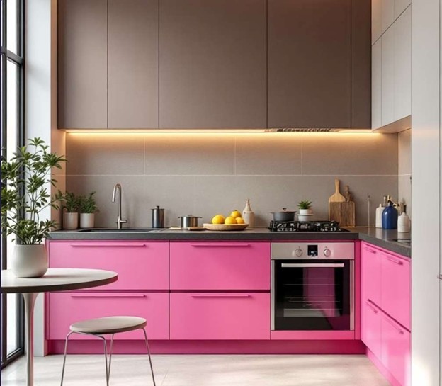
Final result
Now I know exactly what color to pair with what
I can execute the project without the need for an installer
My choices are tasteful, but principled and harmonious
I can easily imagine that my kitchen space is beautiful, functional and unique